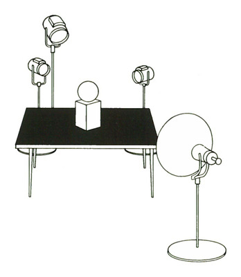
Product Description
Basic Studio Lighting
You have been given a product to photograph in your studio, which means that, together with this product, you have probably been given a series of lighting problems to solve.
Aside from the layout or picture idea, which would show how the product is used or determine its related surroundings (see the outside back cover), you must first deal with basic lighting. That is, by proper arrangement of your lights, you must create a natural, attractive lighting that simulates a natural, OUTDOOR lighting effect. We emphasize the word “outdoor” because outdoor lighting is the standard of comparison for most lightings. Let’s consider briefly how this standard can influence our indoor lighting procedures.
Point One. It is important for light from the main source to come from above, usually at a 40 to 60 degree angle to the subject, because, since the beginning of time, that is the customary sun angle by which most objects are viewed by most people outdoors. (An Eskimo might prefer a lower angle for the main source; a person living on the equator might prefer a near-zenith angle.)
Point Two. Just as outdoors there is just one sun creating one set of shadows, if an indoor studio lighting is to appear natural, it, too, should have one dominant source light and one set of dominant shadows. Although perhaps obvious to old timers, this is one of the most important basic concepts for creating satisfactory studio lightings.
You can see how easy it is to violate this esthetic principle: Simply take two lights of similar intensities and place them approximately equidistant from a subject. The result is artistically chaotic (especially to clients and their art directors!), with twin pairs of highlights and “butterfly” shadows an effect which of course could not be found outdoors.
Point Three. Outdoors, regardless of how contrasty the sunlight sometimes becomes, our eyes — mostly because of their variable sensitivity — can always discern shadow detail. Therefore, the average studio lighting setup should also have sufficient shadow illumination. Of course, this job, accomplished outdoors by the general sky area, must be simulated in the studio with reflectors and/ or auxiliary lights. And, once again, note that the illumination for the shadows must be completely subservient to the basic source light.
The ratio between the main light and the light can vary in accordance with several factors, including the nature of the subject and the personal preference of the photographer. However, a majority of commercial and catalogue illustrations use a highlight-to-shadow ratio in the neighborhood of 8 or 4 to 1.
Point Four. The outdoor effect of overcast days when the sun doesn’t shine has its studio counterpart in lighting for shiny-object photography. Also, this essentially directionless lighting has found new use in modern color photography where the color itself renders many more objects adaptable to this treatment than if the reproduction were to be in monochrome.
BACK LIGHTING HELPS RETAIN DEPTH
There is one additional aspect of basic studio lighting which will influence a majority of your setups. It’s the principle that back lighting will often help to preserve the three-dimensional form of your subjects better than front lighting will. There are two main reasons for this: (a) the fact that the shape of the object is duplicated in the shape of the foreground shadow makes identification easier; and (b), because the object is better separated from its background, delineation of its form is improved.
For example, in photographing a ball, if the ball is front lighted, it will probably look like a round object, but it Will look rounder with back lighting.
To summarize: Most basic studio lightings for product photography consist of a high, single, main-source back light plus adequate fill-in illumination for the shadows. Of course, this generalization must be modified as the nature and shape of the subject demand.
Let’s first examine two basic modifications which might be used for cubical or box-shaped subjects and for spherical or round subjects.
Cubical Objects
3-STEP LIGHTING FOR BOX-SHAPED SUBJECTS
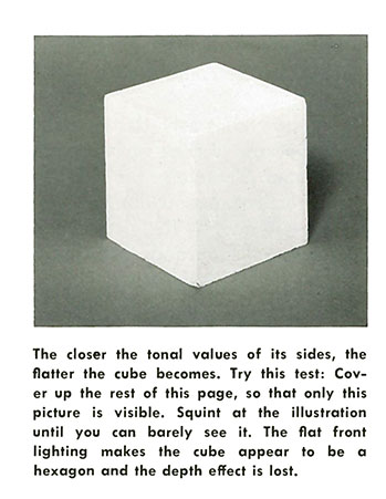
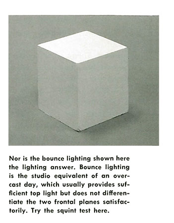
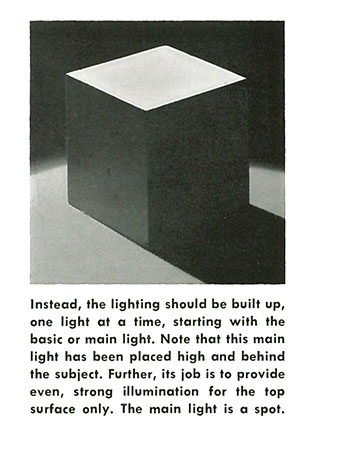
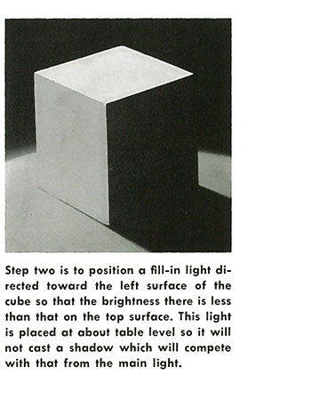
The final step is to provide one more light, also at table level, to add just the correct amount of shadow detail to the right plane of the cube. Note that the tonal differences between the top and left planes and the left and right planes are in fairly equal increments. Also, although three lights were used, there is only one shadow. For close-up work, such as this, a White-cardboard reflector could have taken the place of the third light.
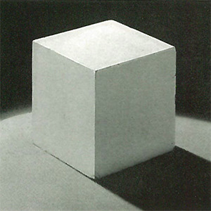
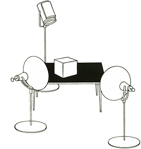
This basic lighting procedure can apply to an infinite number of rectangular or box-shaped products. For example, this lighting would have been equally suitable for a box of cigarettes, a box of cereal, a cake of soap, a radio, or any other subject with a somewhat similar shape.
Spherical Objects
BACK LIGHTING WITH FILL IS THE ANSWER
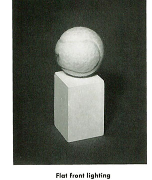
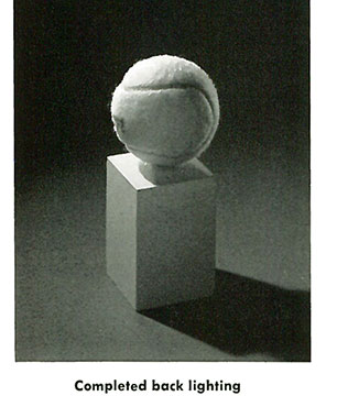
How best to preserve a round object’s roundness — that is the problem. The solution is generally found by (1) using a main back light, (2) outlining the entire subject with slightly overlapped back lighting, and (3) providing adequate fill-in frontal illumination. Note the often overlooked technique of placing a strong accent highlight on top of the main back-lighted area by using a spotlight placed somewhat lower than the main light.
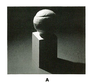
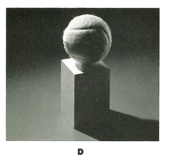
- The first step in the lighting routine is to place the main light high, behind, and to the left of the subject.
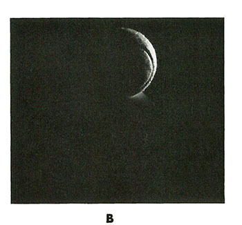
- The remaining portion of the subject is outlined with a second light placed to the right, behind, and at about subject height.
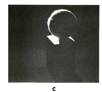
- Added roundness is obtained by a low, third back light, a spotlight, which places a brilliant highlight on top of the main-lighted area.
- The combined effect of the three back lights. A weak light from the front changes this effect into the above completed lighting.
